More SOPA Links
This first link has nothing to do with the SOPA debate but this is extremely relevant. Canadian Conservative Government overturns all previously legal gay marriages if the recipients of that marriage are citizens of sovereign nations that do not allow gay marriage. Next thing you know Saudi Arabian females who live in Canada won’t be allowed to drive. Fubar.
Here are some new links about the SOPA debacle as well all the ones I mentioned in posts before.
Forbes discusses black outs.
I strongly recommend you read this and follow through with the plan.
TLDR: Post the picture found on page two of the above link all over facebook on January 18th, 2012.
The Definitive Post On Why SOPA And Protect IP Are Bad, Bad Ideas.
A good read if you have no idea what the hell this issue is about.
Anti-SOPA/PIPA and those associated.
I’m not sure how many of you out there have been keeping with the recent political theatre because I haven’t. Not that I am disinterested; I just don’t have the time (that sounds so wrong). In any case, over the last month or so, a bill titled “SOPA” (formerly known as E-Parasite) has been circulating congress. This is an anti-piracy bill intended to shut down websites with content that infringes upon copyright. That sounds great doesn’t it? Sure it sounds wonderful but it will do much more harm than good.
The historical intention of copyright was to protect artists and authors from being abused financially. Work shouldn’t be copied and sold without the creator’s knowledge and permission. The diffusion of these works was the creator’s responsibility. The larger the audience, the more money they would make. Besides, scanners and printers weren’t exactly commonplace in the 1800s.
Digital and online media have changed things a bit. Many authors and artiststake advantage of the free-flowing current of the internet to disseminate their works for free. The internet connects thousands persons to one work within a month or less. Before the internet, that kind of reception would take months – maybe years. In other words, by allowing your audience to bypass copyright and engage in intentional infringement by posting your work on their blogs, tweeting about it, adapting it, etc. your work becomes so much more diverse! It’s a phenomenal step towards a communal art space. A hyper-collaborative-gallery if you will. However, this SOPA bill may put a stop to it all.
Techdirt writed Mike Masnick points out the painfully obvious pattern seen in anti-piracy methods implemented in the most recent decade. Guess what? None of them worked. As many may have guessed the more an authority clamps down on infringement (and anything else for that matter), the more infringement occurs. This is a result of an “under-served” audience.
This new bill will essentially provide ISPs the ability to forcefully shut down a web site that contains infringing content or links to that content without warning (unlike conventional anti-piracy methods that provide the user some degree of warning). This does mean less rogue sites will be available – ones that contain infringing content for the good of no one. This also means that by posting a photograph you like on your blog will lead to shut down because it’s not yours. Isn’t that nice? The notion of a peer-to-peer sharing society can potentially implode.
I was sent a link to Forbe writer Paul Tassi’s post about Reddit’s move to protest SOPA. Within the article I read that GoDaddy (the domain host) actually supports this. So I said by to GoDaddy. Yes, this put a massive hamper on my ability to make some school-time money with commissions but frankly I’ve made my self bored with sitting idle while shit like this happened. First, the US NDAA bill which is absolutely FUBAR. And, now more of this hyper-McCarthy crap.
If you’d like to read the SOPA bill click here.
This does mean that both http://www.azzopardiphotography.ca and matthew@azzopardiphotography.ca are no longer valid. Until I find another provider please check back to this blog for updates and email matthewazzopardi@rogers.com with any questions about this post, my work, or commissions.
CCT357: Lab 2, The Portrait
You read the title and I bet you’re asking yourself wtf does that mean? CCT357 is one of the many practical/theory courses about digital media offered by the University of Toronto Mississauga (UTM). This particular course discusses the social effect photographs have on the public and our perception of the world; rather the world affects our perception of the photograph. In addition to this class, I’ll be making posts every week about work done through out this semester.
Today was an introduction to manual photography. In the last three hours I had to restrict myself from blurting out answers to technical questions or even correcting the photographer’s hasty way of teaching the class how to shoot in manual. That being said we’re being taught by Professor Kathleen and assisted by a very, very (I’ll say it again), very talented photographer Peter Andrew. This weeks lab was simply about how to capture a class portrait.
This is a photograph of my friend Oscar. Photographed with Nikon D700 at 44mm set to 1/160, f/2.8, and ISO 1600.
This is a photograph of me taken by my friend and colleague Oscar Cordero-Graf.
An Update About Stuff
**EDIT: incorrect dates. I’ll keep posting about updates as they come along. Sorry for any confusion.**
First of all here are some photographs I snapped while on a walk with my girlfriend Steph.


In February of 2012, I will be exhibiting selections from one of my photo series “The Charity” at UTM’s 10th Annual Arts Festival. Tickets are being sold for $10.00 (subject to change) around the campus. The event is still being organized so I’ll update you about it time to time. I would greatly appreciate all of you who get a chance to check out the exhibit; not just for my work but to see what the artists of this age produce.
You can visit the UTM Art Festival facebook page for more frequent updates.
Several Pets and a Camera
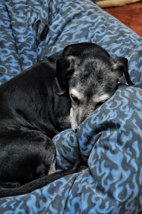
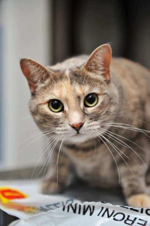
Im spending the early portion of this day with my girlfriend, Steph. We a brisk walk from UTM to her house and once we got there, her dogs were being their usual selves. What was different was I had my camera with me. Following this post, I’ll be uploading some photographs from a charity event at a small bakery called Cupid’s.
A Brave New “Mike’s Dog House”.
Today, I had to present a new visual identity made for a local business with a group for UTM’s CCT352: History and Practice of Design class. The goal was to rebrand a business on the visual front-end: logo/wordmark, stationary, and an ad. My group consisting of Carmica Marcelo, Patrick Colucci, Filipe Santos and I decided to rebrand a hot dog vendor within UTM called “Mike’s Dog House”. The current logo looks like clip art. Wait… It is clip art.
We googled clip art repositories and landed on http://www.iclipart.com. We found the logo on our first try by using “food vendor” as the search terms. One or two changes were made but come on.After tearing it apart and analyzing his colourful menu we decided on this logo. Shown on the business card graphic, we chose a black and white colour scheme. As simple and novice as it may seem, black and white alludes to a black-tie event: high quality food for those who do not have a budget to worry about.
Hold on a second. Why would we want to associate extra expense with a hot dog vendor catering to overstressed and overspent students? Well, we’re not. The colour scheme suggests the quality of the food but the name “Mike’s Dog House” contains the sign for student budgets. They’re hot dogs. The hot dog itself is associated with street meat and food on a budget. So, these two signs balance each other representing quality food on a budget.
The Pitbull in the logo signifies Mike’s Dog House’s aggression in the competitive space at UTM. There are several other businesses on campus that serve students. To most students, ordering food from a black truck located in the middle of the campus doesn’t scream “REALLY GOOD FOOD HERE”. It’s more like offering decent barbequed sausages instead of free candy. Both appealing. Both suspicious. By using a graphic of a pitbull and the above implications, students will recognize it as a serious supplier of food.
All stationary repeats the motif of an abstract hot dog easily identified by the tanned buns, dark meat, with ketchup and mustard on either side. Continuity is key.
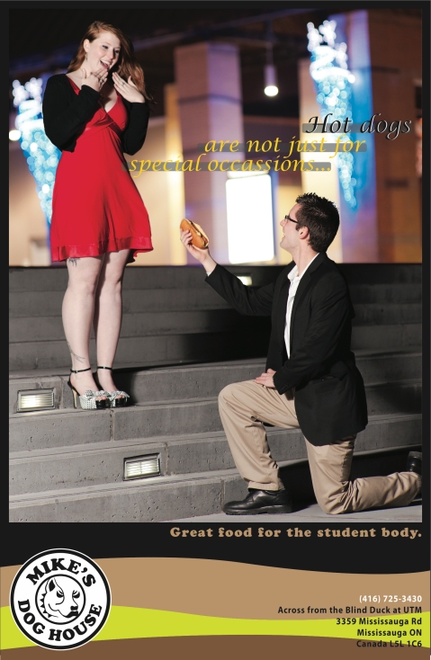
Finally, I designed the print advertisement for the company. The campaign is fairly one-dimensional. After all, this is a graphic design course, not marketing.
The premise is this: a series of photographs capturing moments of celebration or seriousness where the key objects that define these moments are replaced a hot dog. The idea here is that customers will begin to associate hot dogs and sausages with fine dining, serious events, and quality.The caption in the advertisement “Hot dogs are not just for special occasions” uses irony to involve the viewer. When were hot dogs ever reserved to special occasions? In this ad, the viewer must accept that at some point, hot dogs were reserved for special occasions and now Mike’s Dog House is sharing the delicacy across all occasions. The following slogan “great food for the student body” directs attention to the audience. As a student, the viewer feels personally attended to by the food catered by Mike’s Dog House.
Logo: Filipe Santos
Stationary: Patrick Colucci
Ad: Matthew Azzopardi
Leave me some feedback about the ad!
Over the next few months I’ll be working on some more ads just to play around with. They will be posted periodically to this blog.
D700 versus D7000 test
Ah here it is. It’s not the prettiest test in the world but on top of all my other work this will suffice. Click the link to download the .pdf file and let me know what you think through the comment section below.
This is a test between Nikon’s D700 and D7000. I did for sheer curiosity sake. There aren’t too many reviews that put these two models head to head so I did this to see for my self and show others the real difference between the two models. I love my D700 but the video feature of the D7000 and reviews by my colleagues intrigued me. So I have my answer. I’m keeping my D700.


