CCT357: Lab 2, The Portrait
You read the title and I bet you’re asking yourself wtf does that mean? CCT357 is one of the many practical/theory courses about digital media offered by the University of Toronto Mississauga (UTM). This particular course discusses the social effect photographs have on the public and our perception of the world; rather the world affects our perception of the photograph. In addition to this class, I’ll be making posts every week about work done through out this semester.
Today was an introduction to manual photography. In the last three hours I had to restrict myself from blurting out answers to technical questions or even correcting the photographer’s hasty way of teaching the class how to shoot in manual. That being said we’re being taught by Professor Kathleen and assisted by a very, very (I’ll say it again), very talented photographer Peter Andrew. This weeks lab was simply about how to capture a class portrait.

A portrait of Oscar Cordero Graf.
This is a photograph of my friend Oscar. Photographed with Nikon D700 at 44mm set to 1/160, f/2.8, and ISO 1600.

A portrait of Matthew Azzopardi.
This is a photograph of me taken by my friend and colleague Oscar Cordero-Graf.
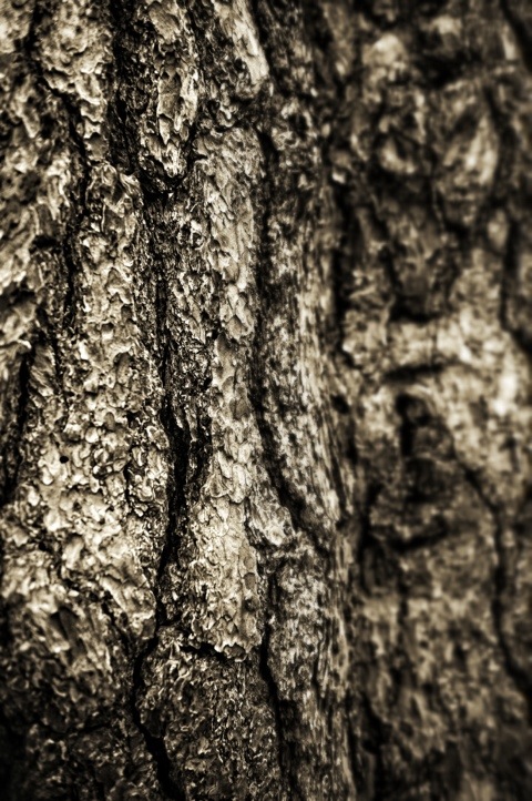
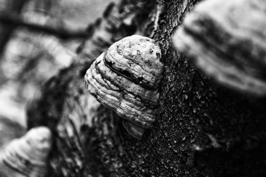
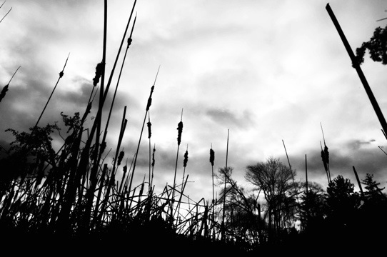
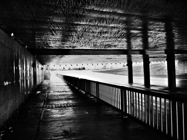
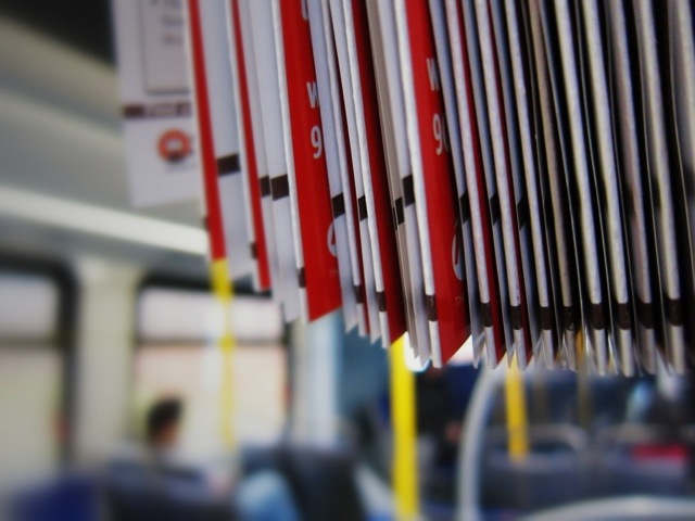
UTM In Monochrome
Here are just a few photographs I snapped today waiting to go to Sheridan from University of Toronto Mississauga. All were edited with Snapseed.


An Update About Stuff
**EDIT: incorrect dates. I’ll keep posting about updates as they come along. Sorry for any confusion.**
First of all here are some photographs I snapped while on a walk with my girlfriend Steph.


In February of 2012, I will be exhibiting selections from one of my photo series “The Charity” at UTM’s 10th Annual Arts Festival. Tickets are being sold for $10.00 (subject to change) around the campus. The event is still being organized so I’ll update you about it time to time. I would greatly appreciate all of you who get a chance to check out the exhibit; not just for my work but to see what the artists of this age produce.
You can visit the UTM Art Festival facebook page for more frequent updates.
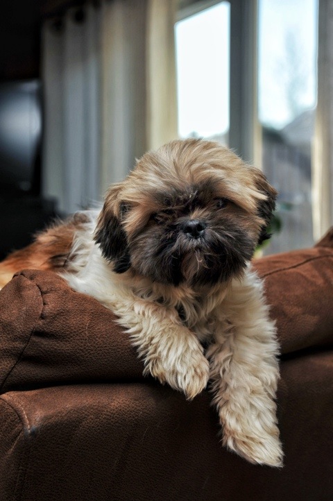
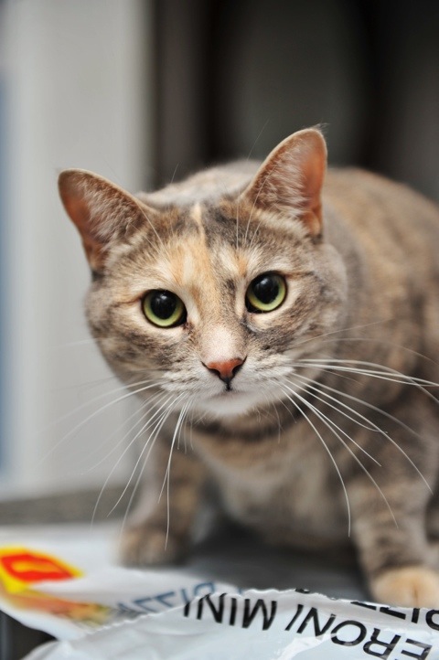
Several Pets and a Camera
Im spending the early portion of this day with my girlfriend, Steph. We a brisk walk from UTM to her house and once we got there, her dogs were being their usual selves. What was different was I had my camera with me. Following this post, I’ll be uploading some photographs from a charity event at a small bakery called Cupid’s.


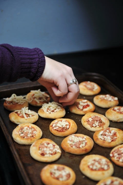
And bagel bites with extra extra cheese!!
A Brave New “Mike’s Dog House”.
Today, I had to present a new visual identity made for a local business with a group for UTM’s CCT352: History and Practice of Design class. The goal was to rebrand a business on the visual front-end: logo/wordmark, stationary, and an ad. My group consisting of Carmica Marcelo, Patrick Colucci, Filipe Santos and I decided to rebrand a hot dog vendor within UTM called “Mike’s Dog House”. The current logo looks like clip art. Wait… It is clip art.

Mike's Dog House logo
After tearing it apart and analyzing his colourful menu we decided on this logo. Shown on the business card graphic, we chose a black and white colour scheme. As simple and novice as it may seem, black and white alludes to a black-tie event: high quality food for those who do not have a budget to worry about.
Hold on a second. Why would we want to associate extra expense with a hot dog vendor catering to overstressed and overspent students? Well, we’re not. The colour scheme suggests the quality of the food but the name “Mike’s Dog House” contains the sign for student budgets. They’re hot dogs. The hot dog itself is associated with street meat and food on a budget. So, these two signs balance each other representing quality food on a budget.
 Card")
Mike's Dog House (New) Card
The Pitbull in the logo signifies Mike’s Dog House’s aggression in the competitive space at UTM. There are several other businesses on campus that serve students. To most students, ordering food from a black truck located in the middle of the campus doesn’t scream “REALLY GOOD FOOD HERE”. It’s more like offering decent barbequed sausages instead of free candy. Both appealing. Both suspicious. By using a graphic of a pitbull and the above implications, students will recognize it as a serious supplier of food.
All stationary repeats the motif of an abstract hot dog easily identified by the tanned buns, dark meat, with ketchup and mustard on either side. Continuity is key.
Finally, I designed the print advertisement for the company. The campaign is fairly one-dimensional. After all, this is a graphic design course, not marketing.

Mike's Dog House Ad
The caption in the advertisement “Hot dogs are not just for special occasions” uses irony to involve the viewer. When were hot dogs ever reserved to special occasions? In this ad, the viewer must accept that at some point, hot dogs were reserved for special occasions and now Mike’s Dog House is sharing the delicacy across all occasions. The following slogan “great food for the student body” directs attention to the audience. As a student, the viewer feels personally attended to by the food catered by Mike’s Dog House.
Logo: Filipe Santos
Stationary: Patrick Colucci
Ad: Matthew Azzopardi
Leave me some feedback about the ad!
Over the next few months I’ll be working on some more ads just to play around with. They will be posted periodically to this blog.
D700 versus D7000 test
Ah here it is. It’s not the prettiest test in the world but on top of all my other work this will suffice. Click the link to download the .pdf file and let me know what you think through the comment section below.
This is a test between Nikon’s D700 and D7000. I did for sheer curiosity sake. There aren’t too many reviews that put these two models head to head so I did this to see for my self and show others the real difference between the two models. I love my D700 but the video feature of the D7000 and reviews by my colleagues intrigued me. So I have my answer. I’m keeping my D700.
Calm before the… Yeah, yeah.
Here I am. Like thousands of other canadian students in the last stretch of the fall semester. The last stretch of demanding assignments shadowed by the fear of finals. By next week I will have completed (or should have completed) a 2012 calendar, a PowerPoint animated short, a film protesting Barrick Gold’s hand in UofT, a meme that went viral, and the rebranding of a small business. This is going to be fun. Once those are all done expect to see several posts showcasing my final works.
Aside from school I’ve been thinking about my camera gear. I’m shooting with the d700 but here’s the kicker: I might switch for the D7000. Yes it’s an APS-C sensor camera but from just playing around with it, the 7000 seems to handle noise significantly better than the 700 and boost color without destruction. My fear is losing my 24-70’s wide angle and my cornucopia of compact flash cards. Which is why I’ll be conducting a comparison next week. If you’re curious which is better check back often. Or wait. Anxiously. Until I tweet again.
Until then I’ll be filming tonight with the Sony a65.
Hours to Kill
Here are some iphotographs that I took while killing two hours of free time in between my classes.


First!
Thanks for clicking onto my blog. If you’re a long time follower I understand your frustration. “Blog space… Pick one!”. I’ve decided to overhaul my web design to be much more visual than it is now. There are too many words and too many links. I’m in the field of photography and presentation means visual, visual, visual. I will also be using this blog (eventually http://www.matthewazzopardi.com) to be the portal into my work and ambitions. Again, sorry to keep you all on your toes so bloody often.
For new followers welcome and stay a while. This blog will be used for recent gigs, performances, and whatever I feel like blabbering on about… Like how Seth Green hasn’t been castes for the Mass Effect film as Joker, inconceivable! Below are some of my external links you might want to bookmark. In the mean time, auf wiedersehen.
